

Today I am going to show you everything you need to know about PE ratio.
I will show you a very straightforward calculation and explain what the calculation means, high and low PE ratios, as well as how you can look at the industry PE ratio to get a sense of what is happening in the markets.
PRICE / EARNINGS
The price to earnings ratio is fairly straightforward.
You take the price divided by the earnings, which gives you how much the company makes at the end of the year. You can use this ratio to compare with other companies to see if you are overpaying or underpaying when you are buying company stocks, real estate, or buying into a private company.
What’s interesting is that the PE ratio is very popular. Ad management knows this well, so PE ratio gets manipulated a lot when it comes to running businesses.
Let’s dive in and take a look at industry standards in comparison to PE ratio.

This is Finviz, a stock screener for financial visualizations. This is a useful tool for visualizing. For example, here is a chart in bubble format.

On this chart, PE ratio is labelled on the X-axis.
On the Y-axis, I want to find the stock growth. With Finviz, you can choose to display stock growth with your desired duration, which can be anywhere from tracking one week, to one year.
For this example, I’ve selected to display a chart for one year performance.
If I invest in the beginning of the year, I want to know what happens by the end of the year.
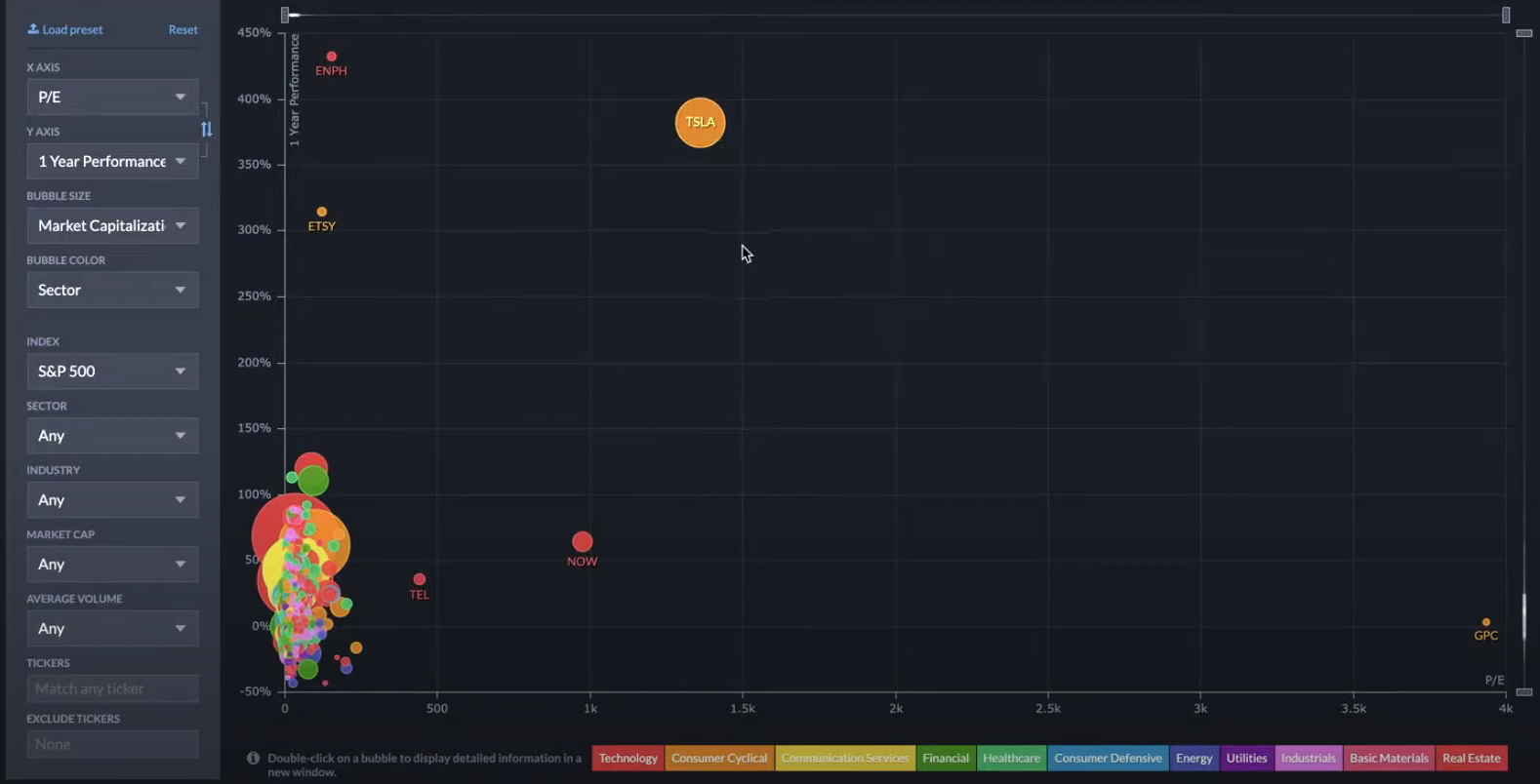
What’s interesting with this map is that growth is scattered all over the place.
You have several outliers, for example, Tesla is the yellow circle way above at the top right where the PE ratio is 1,500 times higher than the stock price increase and the stock price increase over the past year is 400%. So you can see that this is the growth you are looking for.
Tesla, Etsy, and MPH are a few of the stocks that have gone up above 300% in the past 12 months.
OUTLIERS
So is it true that if you have a higher PE ratio, that the stock price will also go up?
Not necessarily, because if you look at this company, GPC, the PE ratio is 4,000, but the stock price increase over the last year is around 0%.
This is due to the fact that this company also includes outliers. Ideally, you will want to eliminate outliers and not consider them into your equation, so you can understand the relationship between price to earnings and the stock improvement.
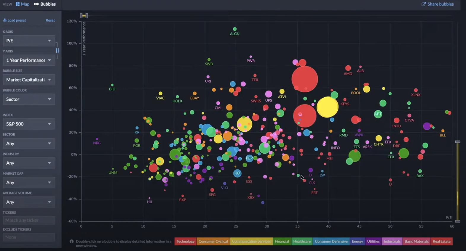
Here is the bubble graph showing a trend after outliers have been eliminated.
What you will find is that the stock price, whether it increases or decreases over a certain year, does not have a very strong correlation to the PE ratio. If it does have a very strong relationship however, then you will see a much narrower band on the chart.
PE RATIO AS AN INDICATOR
In this particular chart you can see high volatility and fluctuation in range.
This is why using a PE ratio alone as an indicator may not be good enough to make you a profitable investor.
For example, let’s say you look for a low PE ratio and select some stocks below 20.
When you buy them, it doesn’t necessarily mean they will go up because you have an entire section of stocks going down also with a low PE ratio.
Alternatively, you can also buy high PE ratio stocks above 40, or even above 60, and you can see that still some stocks are going down.
Therefore, using a PE ratio alone as an indicator still gives you insufficient data to make an educated decision, and you should use other indicators in conjunction with this strategy.
SKEWED DATA
When you take into account how management can manipulate PE ratios, you most likely do not have a clear initial outlook on different companies with different levels of debts, and their varying PE ratios.
It becomes a very noisy and clouded indicator, and it is not a one size fits all. What I am going to do now is dive into a couple of sectors that I think are interesting, so you can have a better understanding.

First, let’s look at technology. You can see that a majority of them are clustered in one area except for a couple that are all the way at the far end to the right.

After I eliminate the outliers, the graph’s average shifts to around 30 to 50.
The next sector I want to choose is finance, which is a more stable industry so I suspect that PE ratios will be lower. This gives you a contrast when you compare to the technology industry.
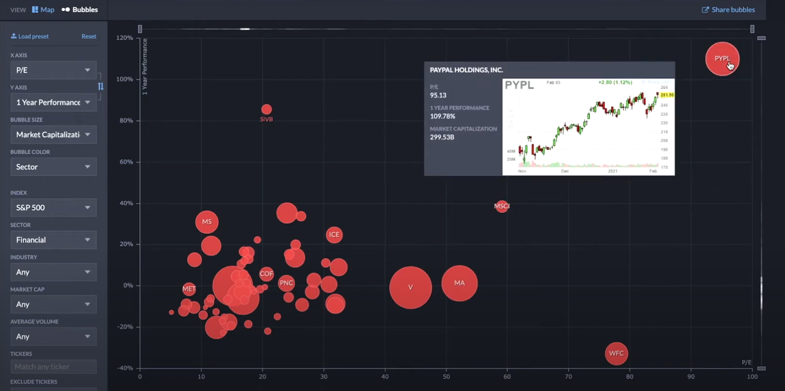
So before applying any filters, you can already see that PayPal is one of the leading companies in this sector.
It is more like a technology company, but I guess they are grouped in here because they also do payment solutions. You can see that its PE ratio is 100, so this is already less than the technology sector.
If I filter this out and get to MSCI for example, then you can see that a majority of the PE ratios is actually somewhere between 10 to 25.

The average at the moment is JP Morgan and Bank of America, which represents the two largest bubbles.
You can also find Visa and MasterCard here, which are closer to payment solutions that are more technology focused, which is why it has a higher price to earnings ratio.
In this chart, you can see and compare it to the technology industry to realize that the industry for financial services’ PE ratio is lower.
Therefore when you are comparing PE ratios, you need to compare it within an industry and probably add an additional filter such as market cap, for example.
If you opt to compare large companies for example, you can filter out a lot of small companies that may have an unnecessarily high fee ratio.

This will give you more of an apple to apple comparison, so that you can compare two similar companies as opposed to two varying ones. I also want to point out that this is also not an end all indicator, because PE ratio can always be manipulated.
MANIPULATING PE RATIO
One way to manipulate this ratio is to have more debt.
If you have more debt, then you have a higher interest. You have a higher return on equity, but you have a higher PE ratio because your earnings are low.
For our financial industry example, even if I filter for a large cap you can see that there is no clear relationship between a high or a low PE ratio compared to the previous year’s performance.
The data is scattered all over the place.
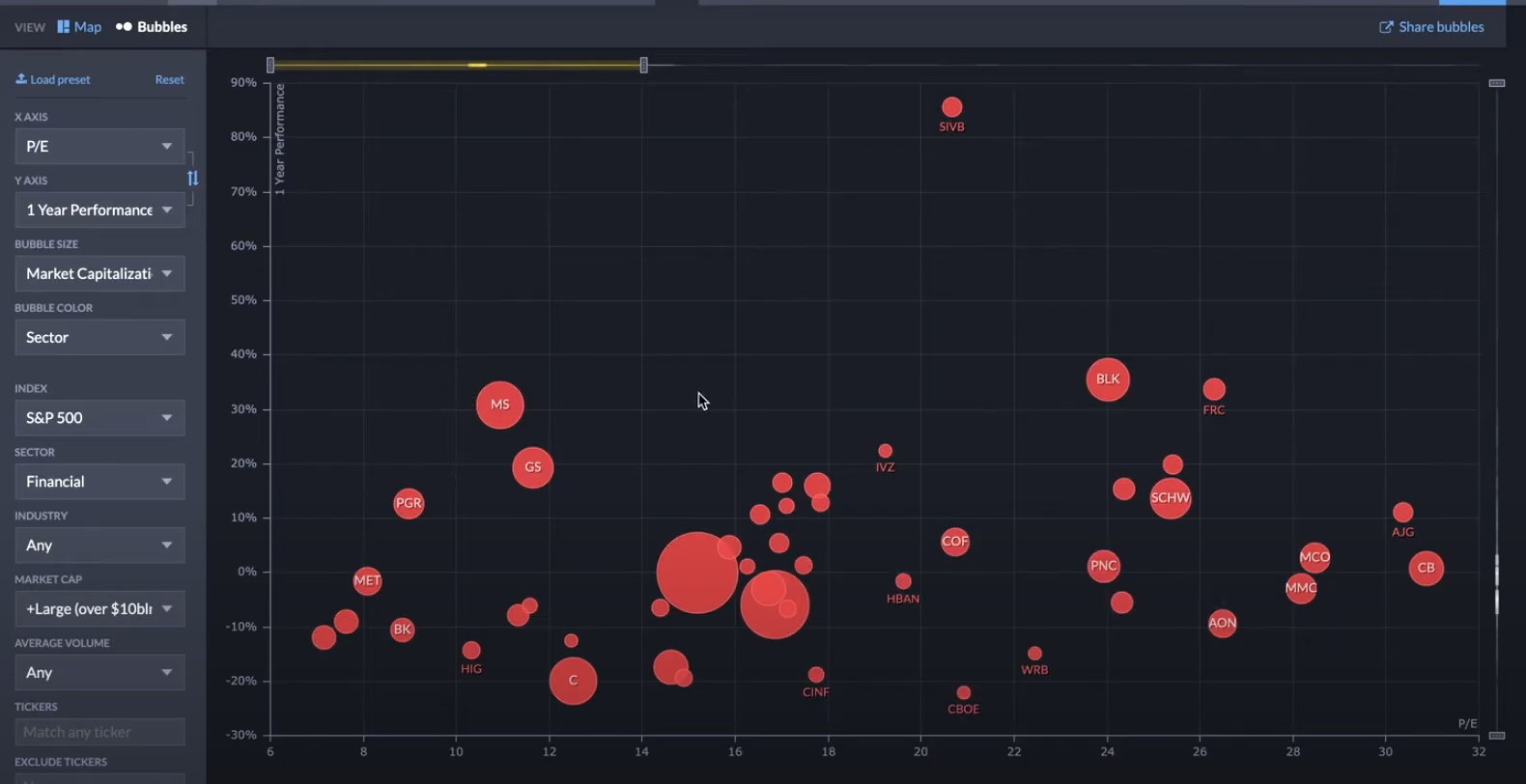
The next time you use a PE ratio as an indicator, be wary. Just because a ratio is low does not necessarily mean that it is good, and a high PE ratio does not necessarily mean that it is bad.
So in this video, I'm going to teach you everything you need to know about PE ratio. So I'm going to go through how to calculate PE ratio, which is very straightforward. What does it mean when it calculate a PE ratio and how do you look at the industry PE ratio to get a sense of what's happening in the markets? And I'll also explain what are a high PE ratio is good, or whether a low PE ratio is good. So let's get started. So 96, 24% of you guys are not subscribed yet it is free and you can always change your mind in the future. And in terms of investing the celebrator this month, I'm looking to help 20 professionals without a financial background to master investing. So to stretch goal is 30, and there's more details at the end of the video. So price to earnings ratio is fairly straightforward.
It's price divided by earnings, which is how much the company makes at the end of the year. You can use this ratio to compare with other companies to see if you're overpaying or underpaying when you're buying the company stocks or you're buying a real estate, or you're buying a private company as well. Now what's interesting is that's price to earnings ratio is very popular. Ad management knows this as well. So price to earnings ratio is also getting manipulated a lot when it comes to running businesses. Why don't we just dive in and take a look at the industry standard when it comes to price to earnings ratio? What I want to use is really fins is because it provides a lot of useful visualization. So I would go to, for example, maps here, and then I would use that bubble charts. And then what I want to see is really priced to earnings ratio, which is PE here on the X axis.
And then on a Y ACCE, I want to find the stock growth so I can choose somewhere between one week, one month, three months, six months to one year performance. So I'm going to choose one year performance. If I invest in the beginning of the year, I want to know what happens by the end of the year. So 12 months is what I'm looking at now, right off the bat. What you'll find is quite interesting is that it is scattered all over the place. You have a couple of outliers. And for example, Tesla is way out here where you see the price to earnings ratio is 1,500 times. And what that means is the price is 1,500 times higher than the stock price increase and a stock price increase for the last 12 months is 400%. So you can see that there is the growth you're looking for.
Tesla, Etsy and MPH are one of the few stocks that in the last 12 months have gone up above 300%. Now, is it always true that if you have a higher price to earnings ratio, it means that the stock price will go up. Well, not necessarily, because if you look at this company GPC, who knows what that is, the price to earnings ratio is 4,000, but the stock price increase or last year is around 0%. So you can see that's what you're seeing here are outliers. And what do you want is really to eliminate the outliers. So then you understand the relationship between price to earnings and the stock improvement. What you will find is that the stock price increase or decrease or a certain year, it does not have a very strong relationship with price to earnings ratio. Now, if it does have a very strong relationship, then you will see the band being very narrow.
But right now we can see that the volatility or the fluctuation or the range is all over the place. So that's why, if you're just using price to earnings ratio alone, as an indicator is probably not good enough to make you a profitable investor, because here's what some of the hypothesis can be. You can be like, okay, I want to look for a low price to earnings ratio, which is around here below 20, and then I'll buy these stocks. But when you buy them, it doesn't necessarily mean they'll go up because you get this whole section of stocks are going down with a low price to earnings ratio. Now, alternatively, you can say to yourself, I can buy high price to earnings ratio stocks like above 40, maybe even above 60 and here. And you do see some stocks that are going down as well.
So using this criteria alone is probably insufficient. And you can see this data clearly communicating that to you. And when you take into account, how management can manipulate price to earnings ratios, different company with different level of debts is going to have a different price to earnings ratio. It just becomes a very noisy indicator and it's not a one size fit. All. What I'm going to do now is to dive into a couple of sectors, which I think are interesting to you, uh, to give you a better field. So the first one is technology. So here we're at technology now, and you can see, majority of them is flustered around here except a couple that are all the way out here. So we're just going to eliminate all the outliers. So after we eliminated the outliers, you can see that, Hey, it seems like the average it's around 30 to 50.
Now the next sector I want to choose. It's really financial because that is a more stable industry. Uh, so then I think the PE ratios are going to be lower. So this will give you a contrast when you compare that to the technology industry. So right off the bat, before we even filter for anything, you can see that PayPal is one of the leading ones. This is more like a technology company. I don't know why they group it in here, but I guess they are doing payment solutions. So that's why it's out here. And then you can see it. A PE ratio is a hundred. So this is already less than the technology sector. And if I filter that out, just to get to, let's say around Ms. CEI here, then you can see that a majority of the price to earnings ratios is actually somewhere between 10 to around 25.
Now we can stretch it and say it as 30. But I would say around 15 to 20 is really the average up to moments, which is a JP Morgan bank of America are the two biggest Bible here. And it gets visa and MasterCard, which are closer to payment solution, which are more technology focused, which is why they have a higher price to earnings ratio. Now, when you think about this, then you can actually compare it to the technology industry to realize that the industry for the financial services, PE ratio is lower. So when you're comparing the PE ratio, you need to compare it within industry and you probably want to do an additional filter like market cap or something. And you want to compare, let's say large. And that will eliminate a lot of other companies are smaller. They might have a ridiculous fee ratio.
So then you get it more Apple to Apple comparison that this is not the end all be all indicator because price to earnings ratio is can always be manipulated. And one way to manipulate price to earnings ratio is to have more debt. If you have more debts, then you have a higher interest. You have a higher return on equity, but you have a higher price to earnings ratio because your earnings is low. So even if you're looking at the financial industry right now, and I filter for large cap, you can see that there is no clear relationship between a high or a low price to earnings ratio versus last year's performance. And you can see is scattered all over the place. The next time you're gonna use price to earnings ratio. You need to be careful because just because something is low doesn't mean as good and something as high doesn't mean as bad as well.
So that's it for this video. So if you're new to the channel and you want to learn more about investing, then I have prepared a free four hour training on my websites. And this is perfect for you. If you're a full-time professional without a financial background or a retiree without a financial background, and you want to manage your own portfolio with confidence, the goal is to get 30% return and you can grab this free training in the description below five minute investing.com/free case study and within investing accelerator, I just want to celebrate, and that our batch of successful case studies where Mary made 48.8% from Altrix in two months, Aaron made 58.9% from Altrix in 28 days. And finally Tony made 30% from Altrix in one month. So congratulations to Mary Erin and Tony. Uh, you did a fantastic job when it comes to investing.
So I look forward to the next one and for investing a celebrator this month, I'm looking to help 20 professionals without a financial background to master investing. The target is to make 30% return and a stretch goal is 30 people. So if you want to join and apply for the program, then you can go to the description and watch the free training to start. And in terms of the book giveaway, uh, I'll be giving away another copy of Sam Walton made in America. So if we reach a hundred likes for this video and you leave a comment below, and once we reach a hundred, like then I'll select a winner. So I'll see you in the next video.